
Adding charts to your website might be useful and it will always look fancy and glamorous. This is a tutorial to create a line chart in your application using React and Chart.js. You can find the full project here.
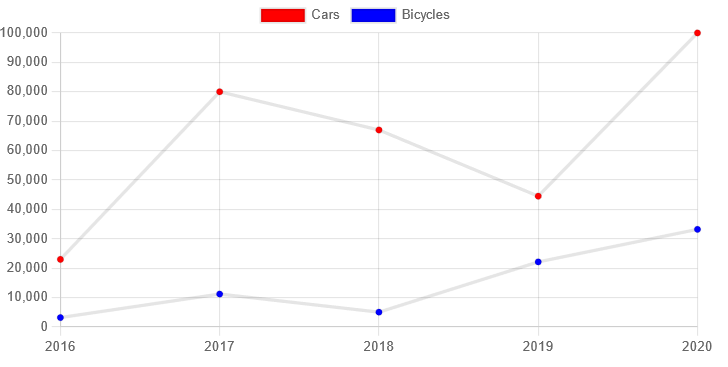
Our chart should look like this:
Sections
Installing
Create React App
First let’s create our simple react project so we can start working. Do the command below:
npx create-react-app line-chart
Installing dependencies
React chartjs 2 provides already built-in components for using it with React, making our life easier. Let’s install it along with chartjs with the following:
npm install --save chart.js react-chartjs-2
Folder structure
Now we have everything that we need set up, let’s create some folders. First, create a components and data folder. Inside components, create a charts folder, this folder will have charts components for every chart type. Our data folder will contain some fake data to test our application. Our directory should look something like this:
1
2
3
4
 src
 |__components
   |__charts
 |__data
Usage
Adding files
First, let’s create our components. Inside src/components/charts create a LineChart.js file and add:
1
2
3
4
5
6
7
8
9
10
11
import React from 'react'
import { Line } from 'react-chartjs-2';
import { Chart as ChartJS } from 'chart.js/auto'

const LineChart = ({ chartData }) => {
  return (
    <Line data={chartData} />
  )
}

export default LineChart;
In the above we are receiving charData as props that will contain all the necessary info for our chart to be built. We’re also importing what we need to our Line chart. If we wanted to use a Bar chart, for example, we would simply change our { Line } import to { Bar }.
The third import is used due to a bug where otherwise it will return a blank screen
Now that we have our components for our chart, let’s create some dummy data to use in this tutorial. Inside our src/data, create a file with some fake data. In our case, we’re adding the following:
1
2
3
4
5
6
7
8
9
10
11
12
13
14
15
16
17
18
19
20
21
22
23
24
25
26
27
28
29
30
31
32
export const citiesData = [
    {
        id: 1,
        year: 2016,
        cars: 23000,
        bicycles: 3223,
    },
    {
        id: 2,
        year: 2017,
        cars: 80000,
        bicycles: 11223,
    },
    {
        id: 3,
        year: 2018,
        cars: 67000,
        bicycles: 5063,
    },
    {
        id: 4,
        year: 2019,
        cars: 44500,
        bicycles: 22143,
    },
    {
        id: 5,
        year: 2020,
        cars: 100000,
        bicycles: 33213,
    },
]
So we’re creating a line chart for displaying info about how many cars and bicycles there is. We’re creating an array of objects, each object will have an id, a year that will represent our X axis, cars and bicycles will be different lines inside our chart. You can add as many as you want and we’ll see how to display our data.
Main file
Now that we’ve created our line chart component and we have some data to fill it in, let’s put everything together to see it working. In our App.js file, let’s first import the files that we just created. We will also use React’s useState hook:
1
2
3
import React, { useState } from 'react';
import LineChart from './components/charts/LineChart';
import { UserData } from './data/fakeLine.js';
Inside our function, let’s handle our data so we can send it to our chart component. Create a data constant with useState and add the the information. Our data object should have labels and datasets key, both being arrays with information:
1
2
3
4
5
6
7
8
9
10
11
12
13
  const [data, setData] = useState({
  labels: UserData.map(data => data.year),
  datasets: [{
        label: "Cars",
        data: UserData.map(data => data.cars),
        backgroundColor: ['red']
    },
    {
      label: "Bicycles",
      data: UserData.map(data => data.bicycles),
      backgroundColor: ['Blue']
    }]
  });
We’ll use javascript’s map method to loop through our fake data and get every year, then we’ll use them as our X axis labels to display our information.
The datasets values will consist of objects, each object will be a different line in our chart. The label key will be our legends on the top of our graph. data will get each line’s value for corresponding year, in the first object we’ll use our data.cars. backgroundColor is to differentiate our dots color in our chart. We can see options available for the object here.
So, that’s it for today. For other types of charts, you should look into the documentation to see what you have to change in your chart’s data and options.
Full code here.
That’s it for today. I hope you like it!